
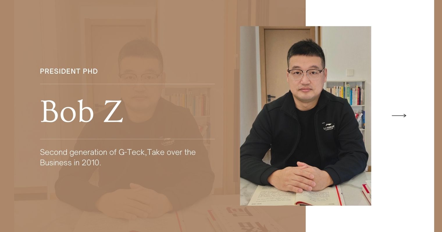
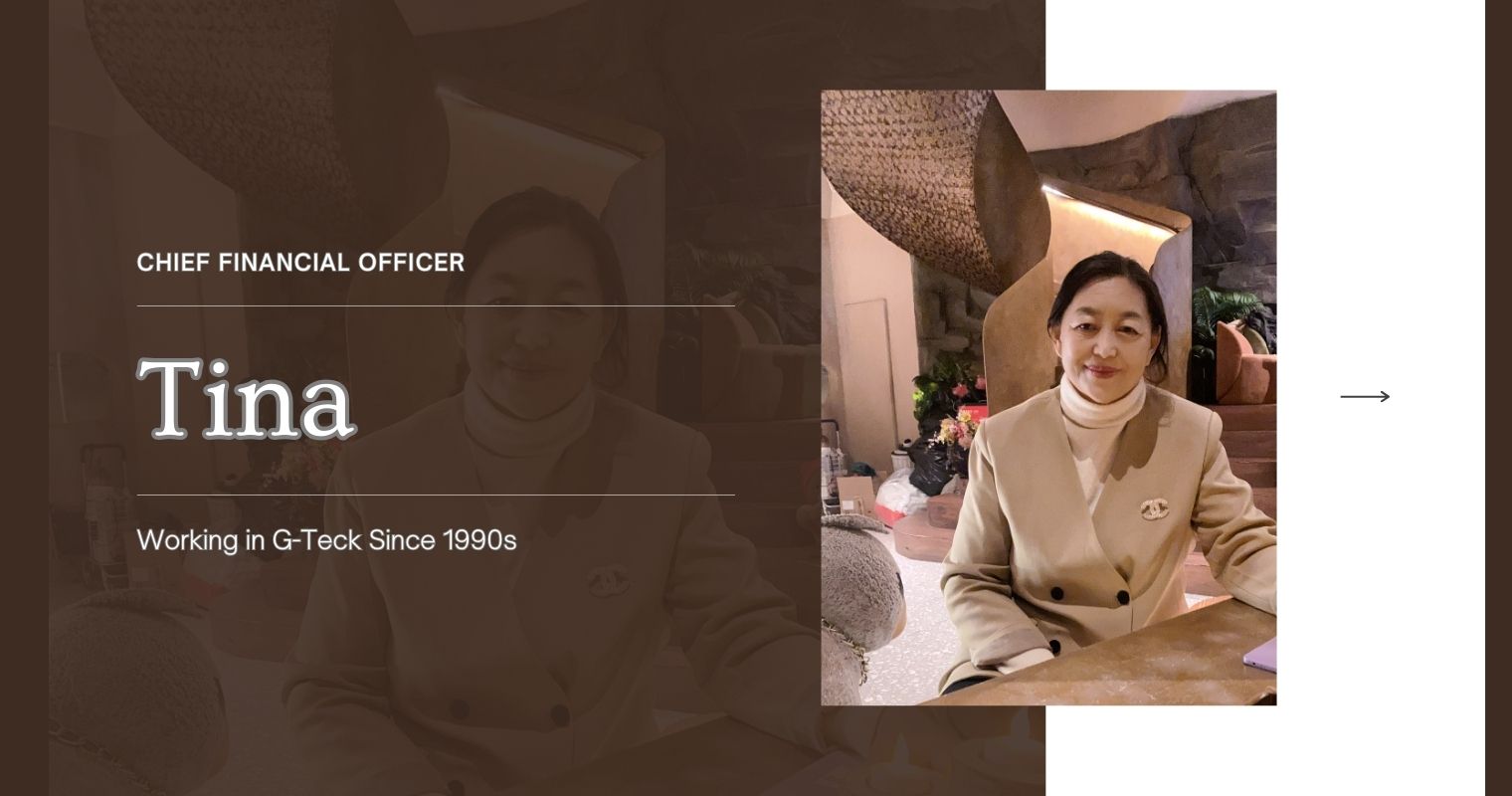
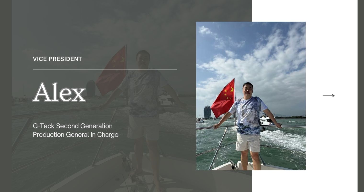
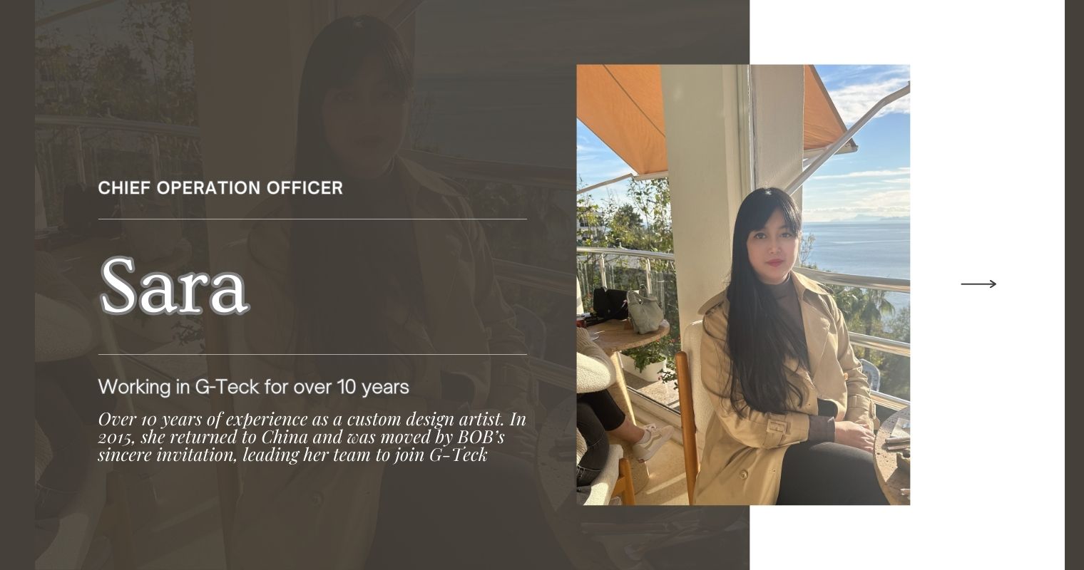
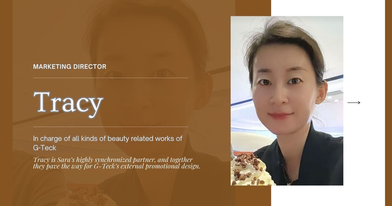
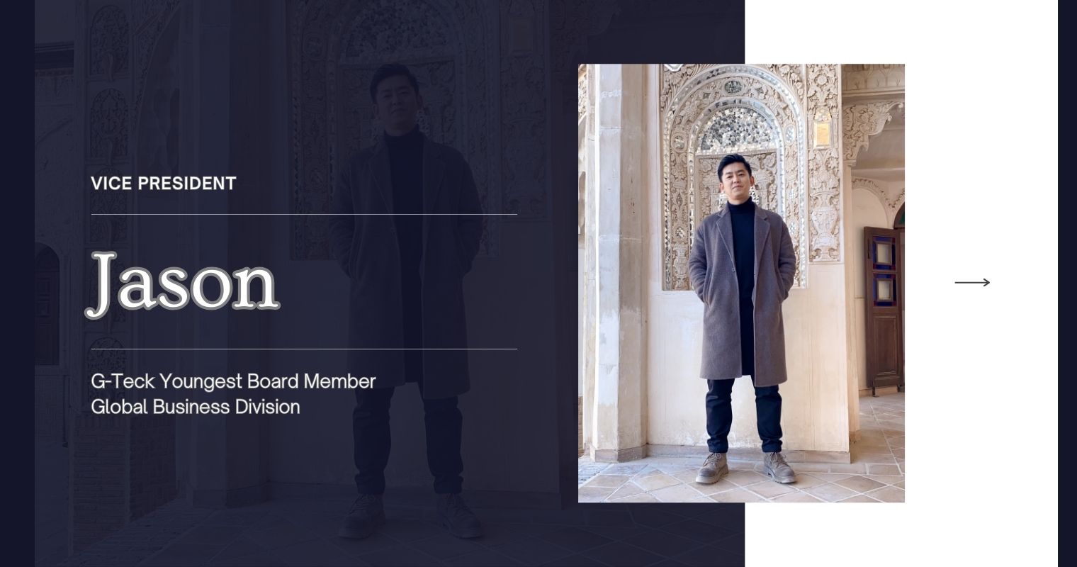
G-Teck Leandership
Executive Representatives

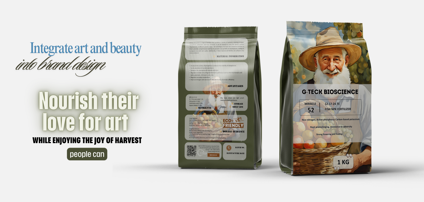
G-Teck Brand Design
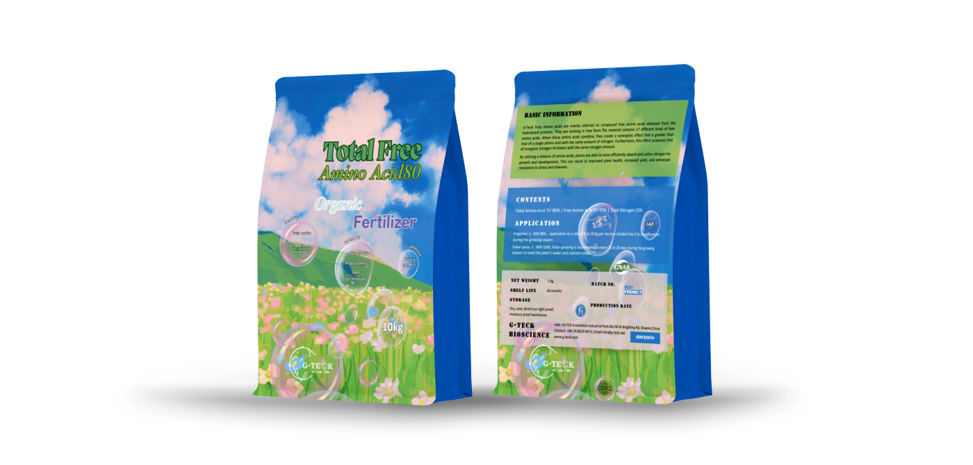
G-Teck deeply understands the geographical and cultural nuances of our target market, allowing us to create packaging designs that resonate with international preferences. As a company rooted in the concept of universal love, which is reflected in our logo and mission, we ensure that all our designs embody this spirit of love.
G-Teck offers a variety of customized packaging solutions to meet the specific needs of different consumer groups. We are committed to providing high-quality, innovative packaging designs that enable our customers to stand out in the market.
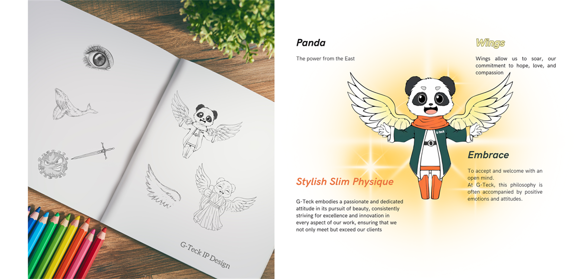
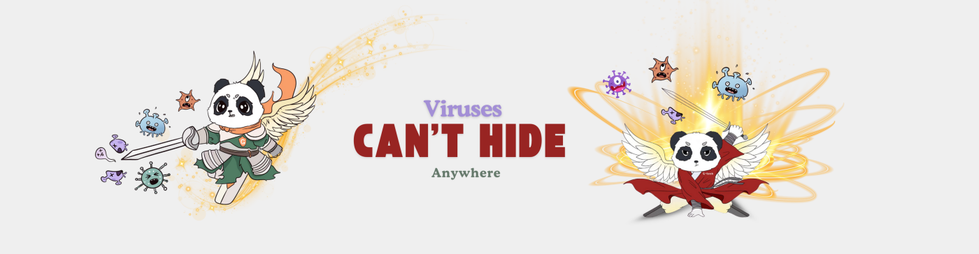
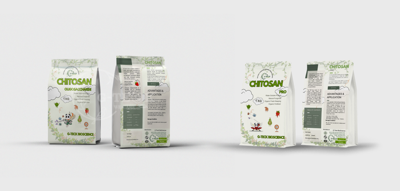
Kung Fu Panda, they are a pair of twin brothers, and they are incredibly powerful

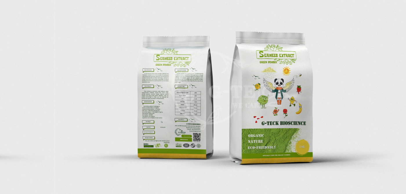
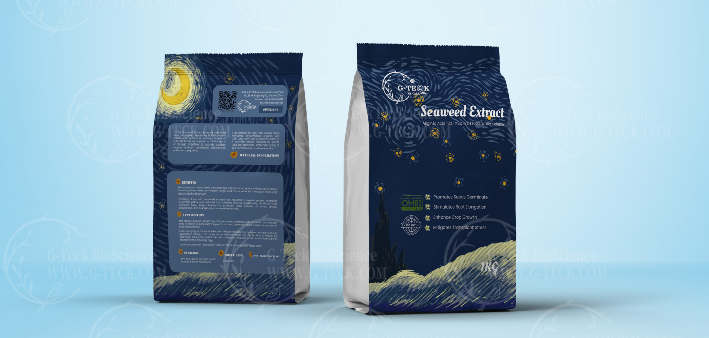
Seaweed Extract Black, like stars shining in the night sky. A tribute to the great artist Van Gogh.
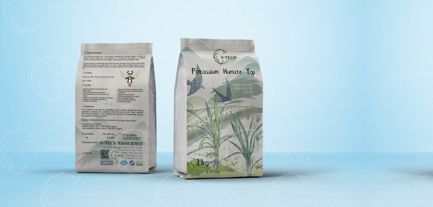
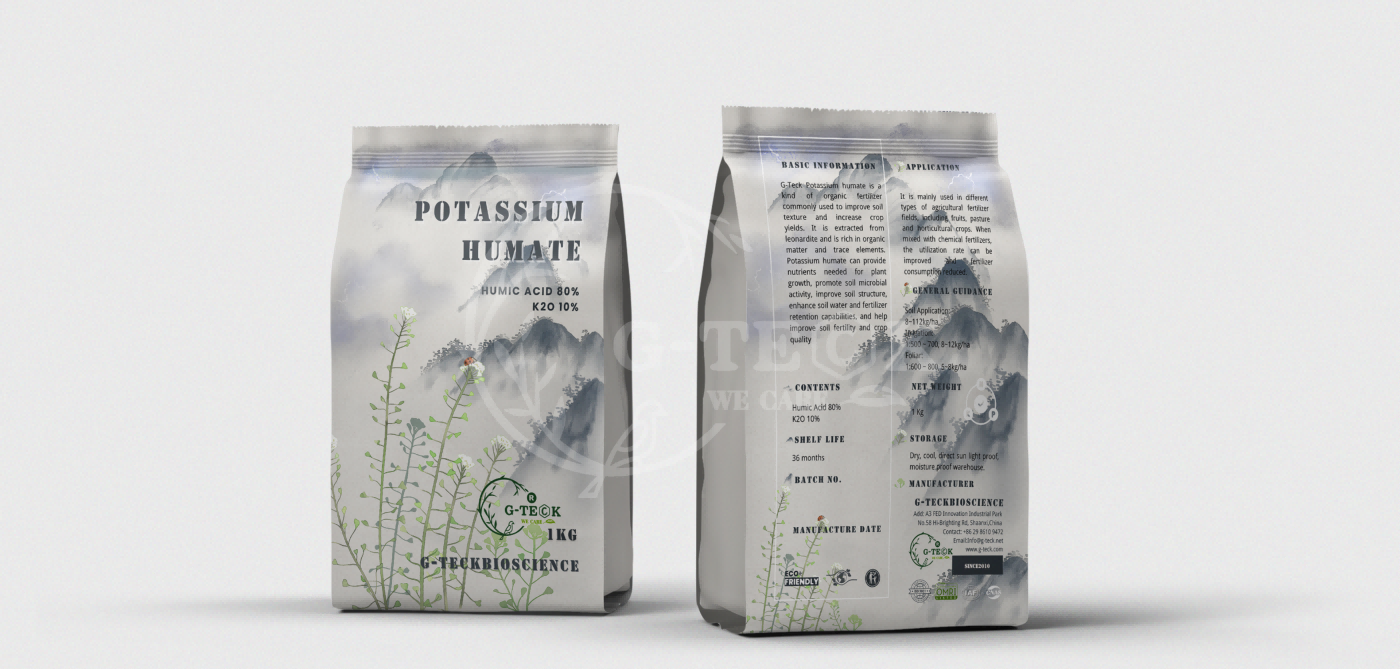
The dissolution of potassium humate resembles ancient Chinese ink wash paintings, as we integrate traditional Chinese ink wash art with potassium humate
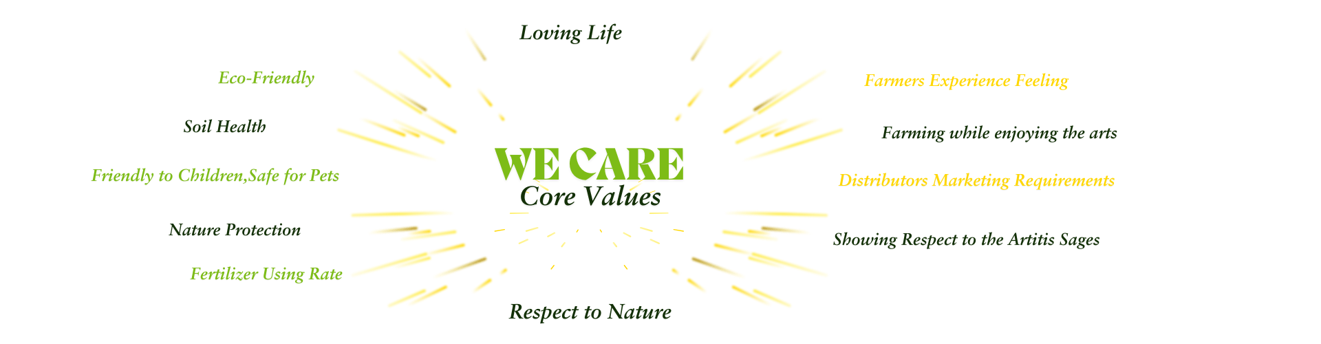
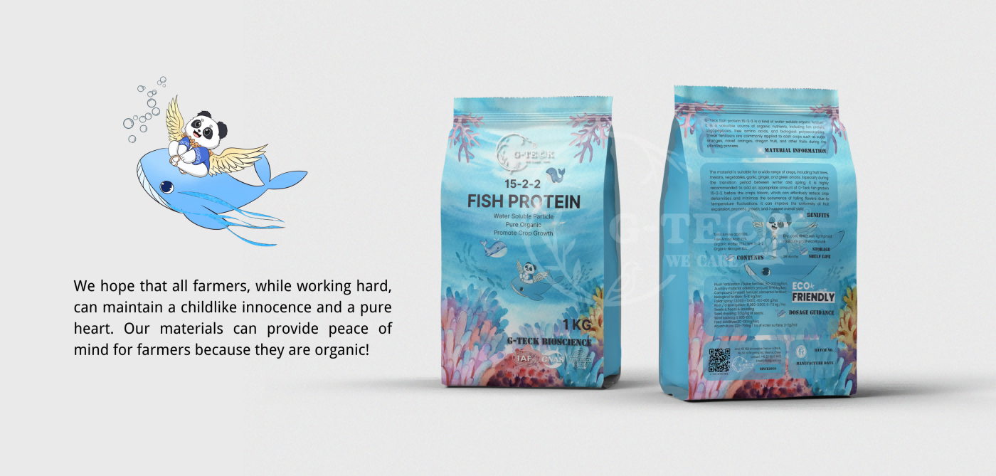
The core values of G-Teck are ‘we care.’ We care not only care about nature, ecology, and business, but also about our colleagues and our "3rd generation". Love means giving without expecting anything in return. Our goal is to fill the world with love, work hard, and enjoy life.
To achieve this, our president Bob specifically asked the marketing team to observe the state of children when designing our brand. They are innocent, carefree, and pure.
We hope to integrate art and beauty into brand design, so that people can nourish their love for art while enjoying the joy of harvest.